
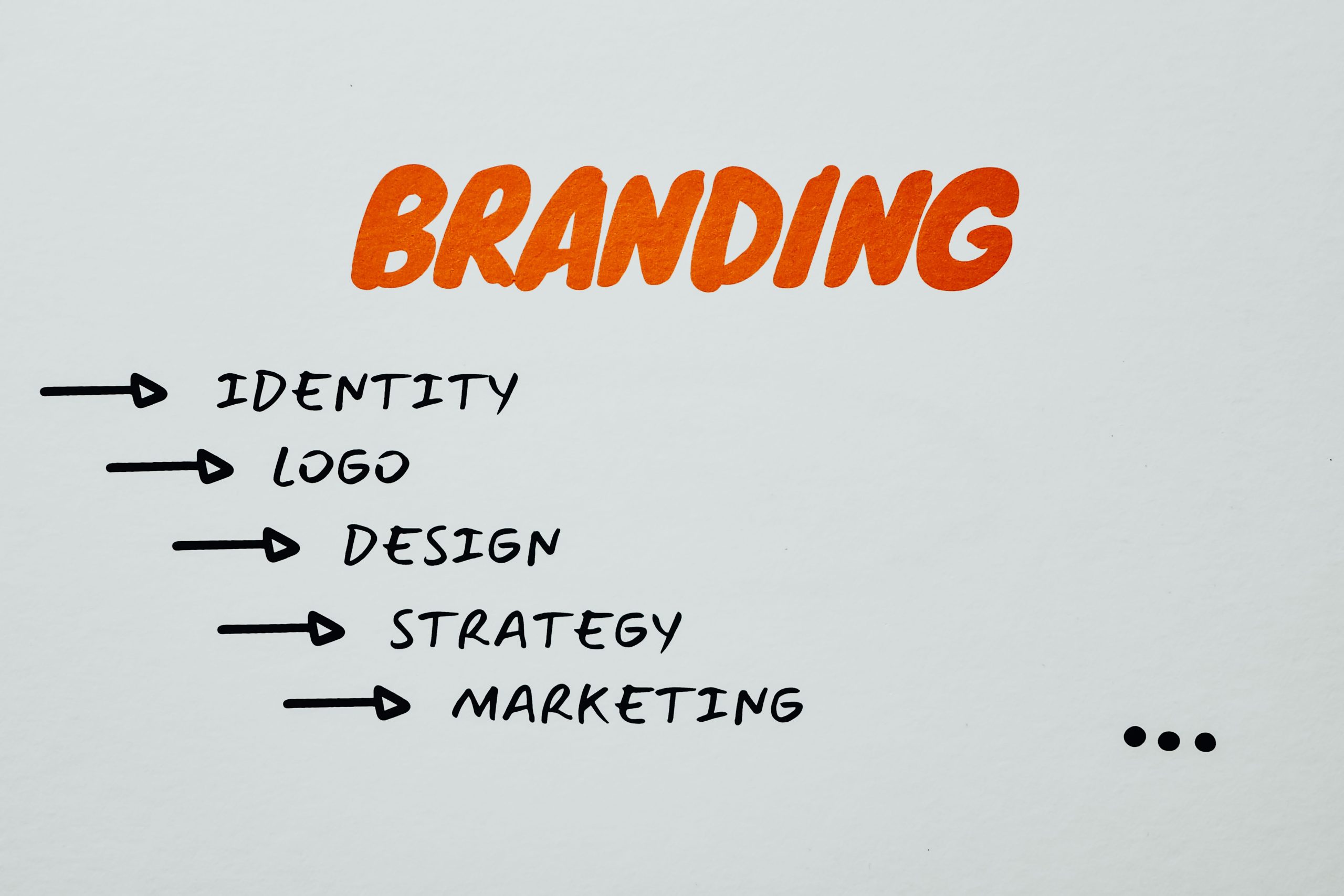
A brand is not only a name or a logo. It is the complete experience that people remember when they interact with your business. A well designed logo, professional branding, and creative stationery help a company build trust and create a strong market presence. At TechyLance, we believe that the final stage of design is where small details make a big difference. Before approving any branding project, businesses should carefully review every element to make sure their identity looks professional, consistent, and ready for the market.
1. Final Logo Design Is Not Tested Properly
Many businesses approve a logo because it looks good on a screen, but they forget to check how it performs in real situations. A professional logo should maintain its quality on websites, social media profiles, packaging, business cards, and promotional materials. A common mistake is ignoring logo flexibility. The final design should work in different sizes, backgrounds, and formats without losing its original impact.
2. Brand Colors Do Not Match the Business Identity
Colors are one of the strongest parts of visual branding. They help customers connect emotionally with a business. Choosing random colors or using different shades in different places can make a brand look confusing. Before final approval, businesses should make sure their color palette represents their industry and remains consistent across the logo, website, stationery, and marketing designs.
3. Typography Is Selected Only for Style Instead of Purpose
A beautiful font does not always mean it is the right choice for a brand. Some fonts may look creative but become difficult to read when used on business cards, documents, or digital platforms. The final typography selection should balance creativity with readability. The right fonts help create a professional brand image and improve customer recognition.
4. Different Branding Elements Do Not Follow One Style
A strong brand always feels connected. A logo, business card, letterhead, social media design, and other stationery items should follow the same visual direction. One of the biggest branding mistakes is creating separate designs that do not feel like part of the same company. A consistent design system makes a business look more reliable and professional.
5. Design Is Not Reviewed for Real World Usage
A branding design should not only look attractive in a design file. It should also work when printed, displayed online, or used in different environments. Many businesses skip this testing process and discover issues after launch. Checking the design on different platforms and materials helps avoid unexpected problems and keeps the brand presentation strong.
6. Small Mistakes Are Ignored During Final Checking
Professional branding depends on attention to detail. A small spelling error, incorrect contact information, poor alignment, or spacing issue can affect the overall impression of a business. Before sending any stationery design for printing or publishing, every element should be carefully reviewed to maintain a high quality brand image.
Why Final Design Review Matters for Your Brand Success
A logo and branding system are long term investments for any business. A carefully reviewed design helps companies create a memorable identity and build customer confidence. At TechyLance, we focus on creating branding solutions that are not only visually appealing but also practical, consistent, and designed for real business growth.
The final review process is where a good design becomes a professional brand identity. By avoiding these common mistakes, businesses can launch a brand that represents their values, connects with their audience, and stands confidently in a competitive market.